brand-guide
Partners
Indy Center partners with communities and developers that align with our mission and support our community. Partners are celebrated on the partners page.
This page is for partners: how to get your page, and how to mention Indy Center on your own channels.
Getting your partner page
Email [email protected] with the items below. We put your page together and let you know when it’s live. Changes later work the same way: email what you’d like changed.
What to send
| Item | Needed? | Details |
|---|---|---|
| Name | Yes | As you want it shown. |
| Logo | Yes | Square, at least 256×256. SVG, PNG or WebP, with a transparent background if you have one. |
| Tagline | Yes | One line, up to 120 characters, shown under your name. |
| About | Yes | A few short paragraphs about who you are and what you make. Plain text; no formatting. |
| Calls to action | Yes, one to three | Buttons that send visitors somewhere. For each, a short label (“Visit website”, “Download the scenery”) and the link. The first is the main one, shown on your card on the partners page. |
| Social links | Optional | Links to your Twitch, YouTube, Discord, X, Instagram, TikTok, Facebook, GitHub, or another website. Each shows as that platform’s icon. |
| Banner | Optional | A wide header image, at least 1600×500. See Your banner. Without one, your page uses a plain gradient. |
| Photos | Optional | Screenshots or photos of your work, for a gallery on your page. |
| Member perks | Optional | Something only Indy Center members get, such as a discount code. For each, a short label, what members get, and the link. Only signed-in members see it; everyone else is invited to join. |
Every image can be up to 10 MB.
Your logo
Your logo appears small: in a square on your card and in the corner of your banner. Send a version that reads clearly at that size, usually your symbol on its own rather than a long wordmark. It sits on a dark background.
Your banner
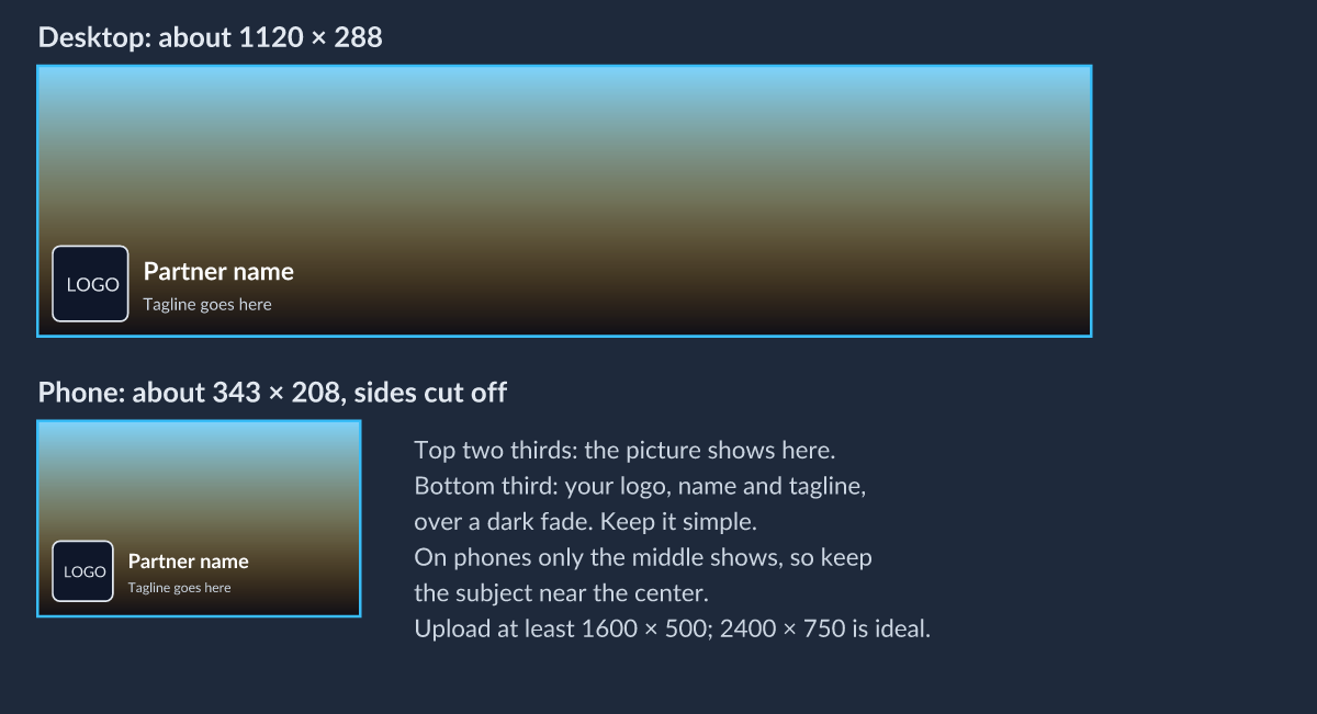
The banner is the header photo across the top of your page. Your logo, name and tagline sit over its lower part, on a dark fade, and phones show only the middle of it.
- Keep the subject in the upper middle of the image.
- Leave the bottom third simple: it’s covered by your logo and name.
- Expect the left and right sides to be cut off on phones.
- Don’t put text in the banner; your name and tagline are already there.
Photos
Photos are optional and show as a featured image with thumbnails under it, and open full screen. The featured image is shown at 4:3 and thumbnails as squares, so keep the subject near the middle. Landscape images of 1600 px wide or more look best.
What your page looks like
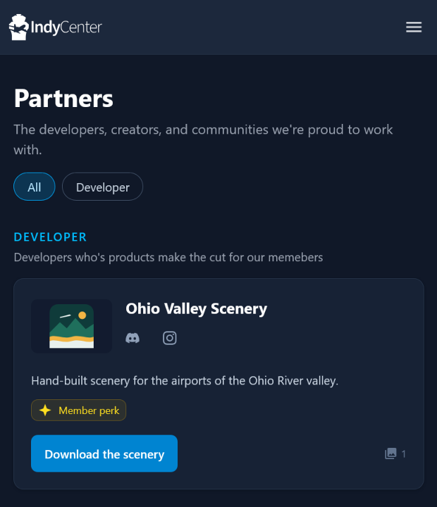
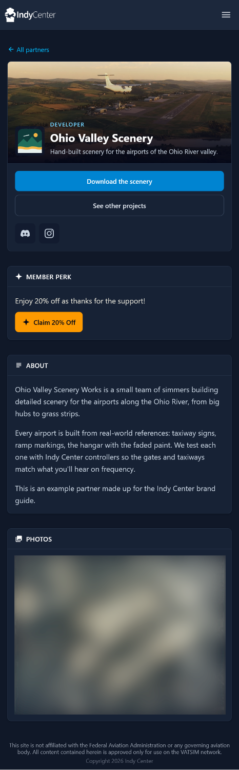
Your card on the partners page, and your own page, shown here for a made-up example partner. Signed-in members see the member perk; everyone else is invited to join Indy Center instead.
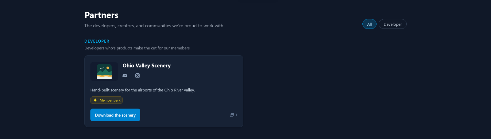
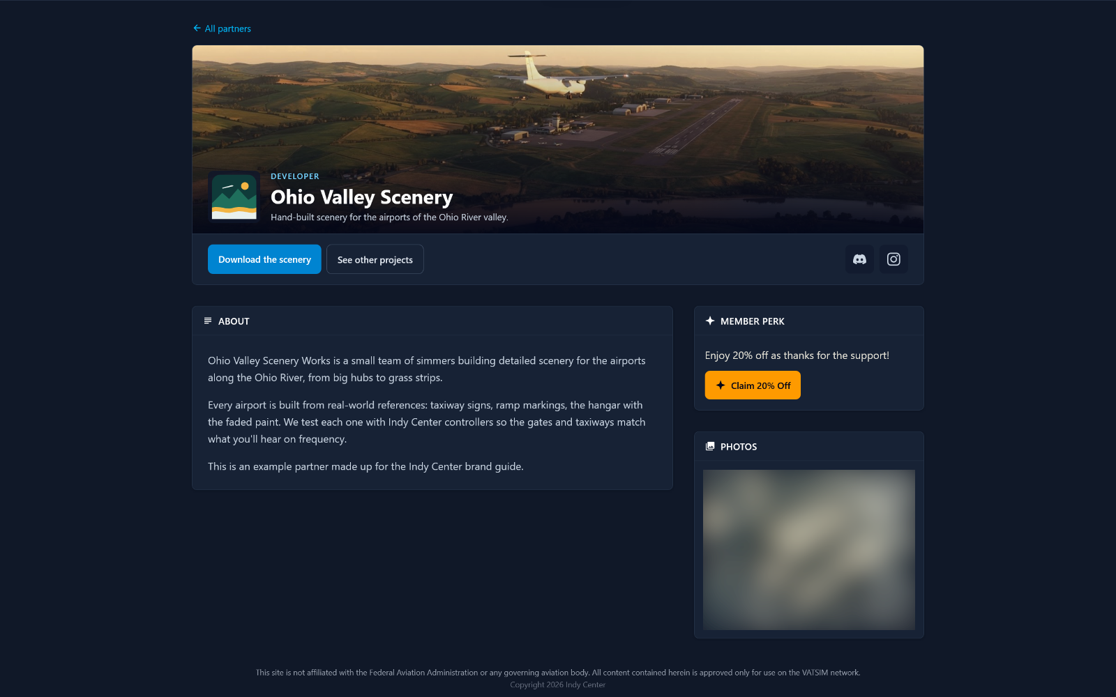
On a phone, the card and page stack into one column, and the member perk moves above About.
| The card | The page |
|---|---|
 |
 |
Mentioning Indy Center
When promoting Indy Center to your community or customers, a few guidelines keep it clear for everyone.
What to say
- “**
is an Indy Center partner.**" - “Partnered with Indy Center.”
- Write the name as two words, Indy Center. See Name and terms.
- Link to your partner page (
flyindycenter.com/partners/<your-page>) or to flyindycenter.com.
What to show
-
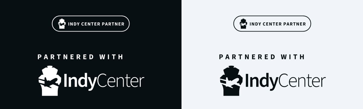
The partner badge, made for exactly this. It comes in two versions: the compact partner badge for overlays, panels and store pages, and partnered with for larger spaces such as credits or a website footer. Each comes in white and black.
- Or the logo or mark, as they are. See Marks.
- Download them from Downloads.
Please don’t edit them, put them in your own logo, or use a special mark without the brand owner’s OK.
Keep it accurate
- The partnership is between you and Indy Center. Don’t suggest that Indy Center endorses everything you make, or that VATSIM or VATUSA is part of it.
- If you offer a member perk, describe it as for Indy Center members.
Questions
Ask the brand owner: the ATM, at [email protected].